9. A UI kit on Canvas 🟡
TTac doesn't use Material components. Its UI kit (ui/components/Components.kt) is built from modifiers,
drawBehind and small canvases — which is how it gets a consistent bouncy, glassy look.




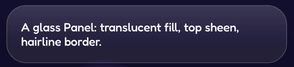
Glass
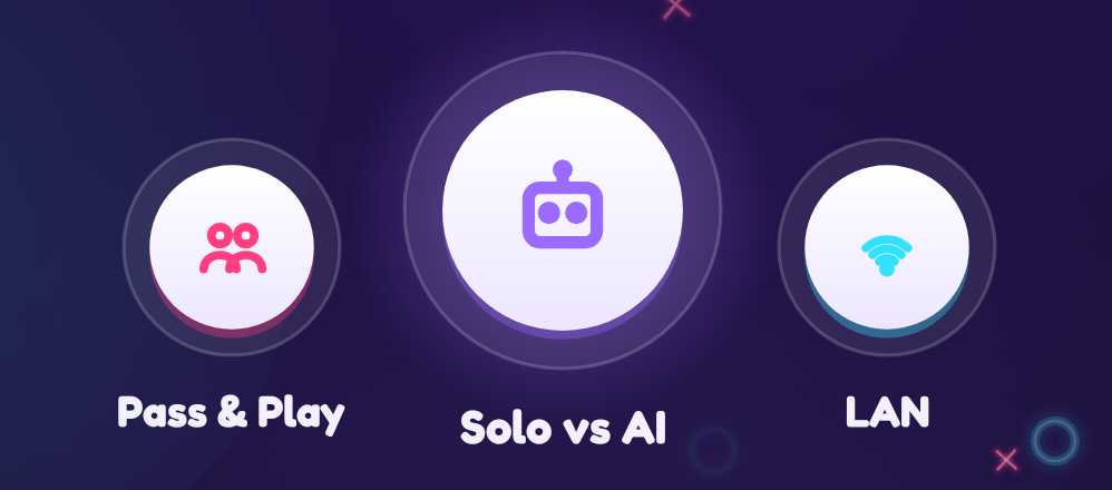
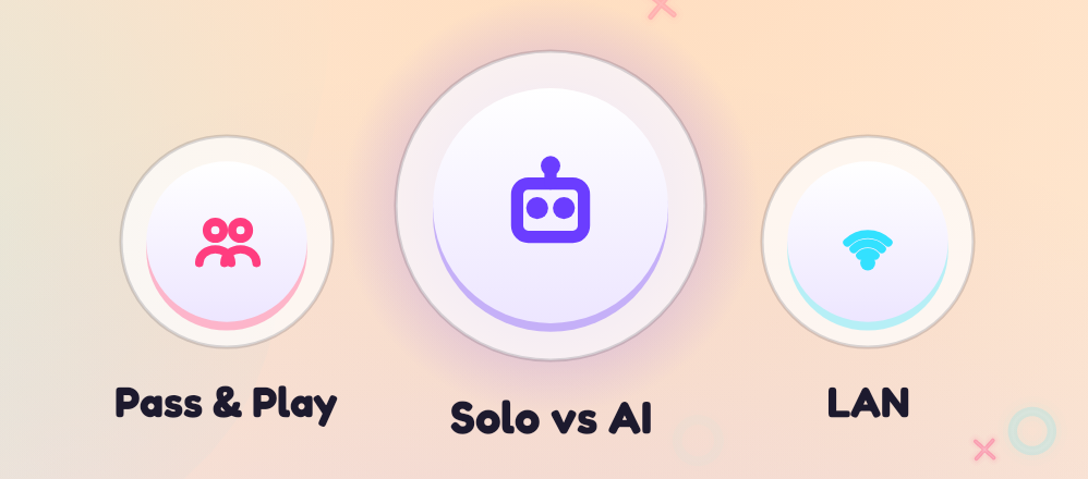
Every card, button track, chip and icon bubble in the capture above is glass — including the Panel with the text.
Glass is three layers drawn behind content:
fun DrawScope.drawGlass(palette: Palette, radius: Float, fill: Color = palette.surface, border: Color = palette.outline) {
    drawRoundRect(fill, cornerRadius = CornerRadius(radius))                                   // 1. translucent fill
    drawRoundRect(Brush.verticalGradient(listOf(white(10%), Transparent), endY = h * 0.6f), …)  // 2. sheen on top
    drawRoundRect(border, …, style = Stroke(1.2.dp.toPx()))                                     // 3. hairline
}
The fill is ~8% white on dark themes, 72% white on light — the backdrop shows through, which is what reads as glass.
Bouncy press
fun Modifier.bouncyClick(onClick: () -> Unit) = composed {
    val scale = remember { Animatable(1f) }
    this.graphicsLayer { scaleX = scale.value; scaleY = scale.value }
        .pointerInput(Unit) {
            awaitEachGesture {
                awaitFirstDown(); launch { scale.animateTo(0.9f, spring(stiffness = High)) }   // squash
                val up = waitForUpOrCancellation()
                launch { scale.animateTo(1f, spring(dampingRatio = 0.3f, stiffness = 500f)) } // wobble back
                if (up != null) onClick()
            }
        }
}
The release spring is under-damped, so every tap wobbles. Scale lives in graphicsLayer → no recomposition.
Segmented picker with a gooey thumb
The thumb position springs between options; while it's moving, its width grows by
|pos − index| × w × 0.35, so the thumb stretches like goo and snaps back when it arrives.
Icons as strokes
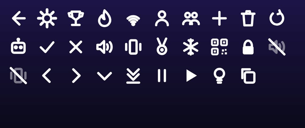
Every icon is a Glyph enum drawn with lines, arcs and small paths in a unit square (drawGlyph). No vector
drawables, and icons inherit colour and scale for free.
Avatars, medals and art
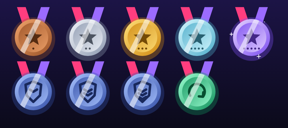
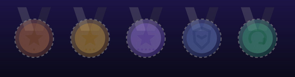
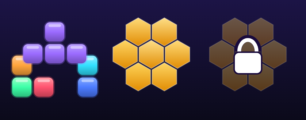
Medals combine every technique so far: a two-tail ribbon path, a disc with a reversed inner gradient (bevel), an
emblem (star with tier pips, shield with chevrons, comeback arrow), and a shine: a white diagonal bar swept across
the disc inside clipPath(disc). Locked medals drop to 28% alpha with a dashed rim.
Light & dark themes
Every colour comes from a Palette (ui/theme/Theme.kt) provided through a CompositionLocal, so the same
components render in either theme without a single if (dark) in screen code. The page you're reading follows your
system theme too — flip it with the toggle in the top bar and the screenshots below follow.
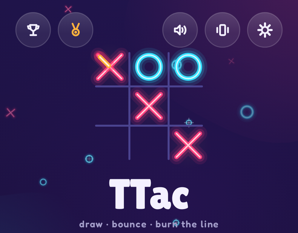
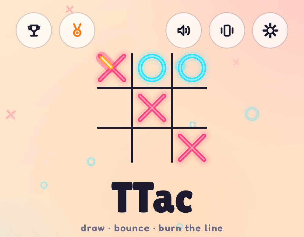
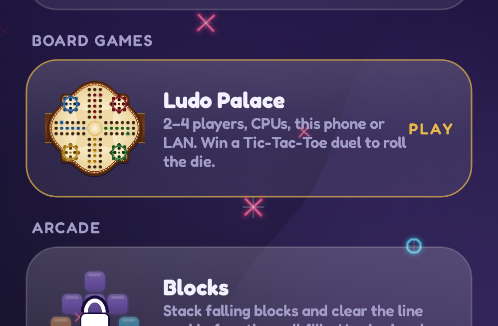
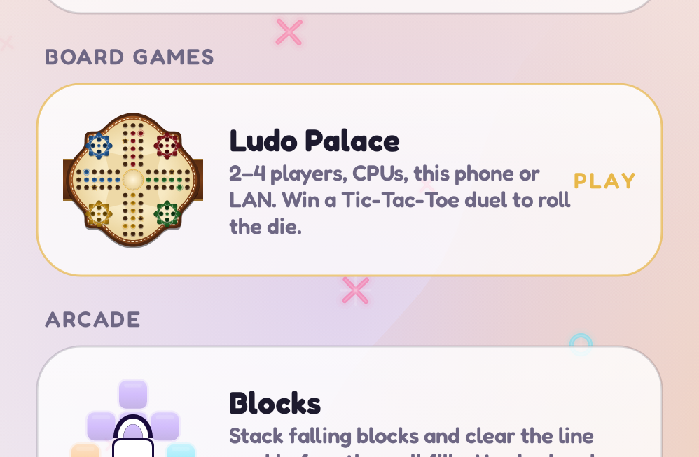
The light palette isn't the dark one inverted: it's warm paper with a darker grid and its own heat ramp, tuned so glows still read on a bright background.
Typography
Two game fonts from the public google/fonts repository (OFL): Lilita One for titles and scores, Fredoka
(variable weight) for everything else. Fredoka's weights come from one file via FontVariation.Settings.
Going further
Modifier.composedlets a modifier own state (the scale Animatable); newer code can useModifier.Nodefor lower overhead.- Semantics matter even for Canvas UI: every
IconBubblesets acontentDescription, switches setRole.Switch, segmented options setselected— which is also what lets UI tests and the Baseline Profile generator find them.